


The term typeface is frequently confused with the term font. Before digital typography, the two terms had more clearly understood meanings. A typeface is the collective name of a family of related fonts. Fonts, however, refer to the weights, widths, and styles that constitute a typeface; like Bold, Italic, Regular, Black, etc.
Types of Typeface
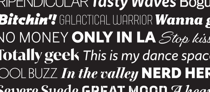
Because of an abundance of typefaces that have been created over the centuries, they are commonly categorized according to how they look.
Roman types are in the most widespread used today, and are often sub-classified as serif, sans serif, ornamental, and script types.
How Typeface affects us: Simplicity
Simple letter types are easier to read, as they don’t distract the reader with showy curls, swirls or heights, and allow the information to be properly absorbed.
How Typeface affects us: Aesthetics
Aesthetics are the quickest ways of making a lasting impression. Great typography creates text that’s attractive, informative and easy to read, thereby encouraging consumers to buy.
Things like font, color, emphasis and spacing can affect the way people read, comprehend and view information. If executed correctly, typography can subconsciously embed the message of the ad into the mind of the consumer.
To make the right stylistic choices:
- study your audience (what are their demographics?),
- consider the medium being used (print, web, mobile, etc.),
- reflect on the overall purpose of each chosen word
How Typeface affects us: Emotion
In advertising, typography can add to a document’s personality, reinforce or communicate messages, and even influence emotions
Typefaces go beyond the apparent written meaning and communicate more than what appears to the eye.
- employ visual cues to set expectations about the product
- help to communicate a product’s underlying meaning
- complement products
Scrutinizing the emotional responses to typography has become a necessity.
“Featured in 2007’s documentary ‘Helvetica’, Neville Brody, a prominent graphic designer stated, ‘The way a message is dressed is going to define our reaction to that message in the advertising. So if it says, ‘buy these jeans’, and it’s a grunge font, you would expect it to be some kind of ripped jeans or to be sold in some kind of underground clothing store. If you see the same message in Helvetica, you know it’s probably on sale at Gap.’”

Benjamin Tomlin is a Graphic Designer for Diamond Media Solutions.
No Comments