
Ok, you’ve got a great email design and you’ve followed our tips to make more people click. Now here is a great way to drive even more conversions from that email; an effective landing page.
A landing page is an isolated and very concise web page built specifically to complement an email, display, or even direct mail campaign. The page will guide and persuade visitors to complete the target action for that campaign. Examples of this can be purchasing a product, clipping a coupon, downloading an informational document, or signing up for further correspondence. Landing pages eliminate distractions to focus the visitor’s attention on what you want them to do.
When you first begin to think about your page design, keep in mind that you want to create a seamless transitional experience between your email and the page. You’ll want to use the same graphics, colors, and fonts, with maybe some complementary different touches only. It is also important to think about “the fold” which refers to the point of the page where the visitor will have to begin scrolling. Make sure all the most important elements are above this line, especially the Call to Action (CTA) area. Take into consideration different platform sizes when you do this. If you need to create a longer page with more information, consider repeating the CTA at the end of your page.
Once a visitor has landed on your page, you still only have a few seconds to keep them there and get their interest, and hopefully, action. There are some things you can think about as you design your landing page that increases conversions. Let’s go over the typical anatomy of the landing page and some tips to make them more effective. A landing page generally consists of a headline, copy, image elements, and the CTA.
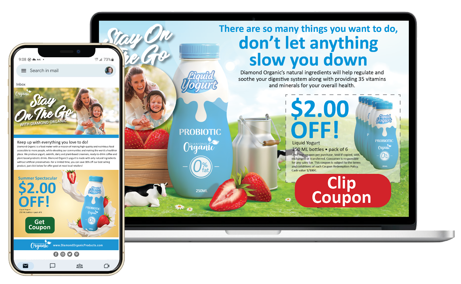
Speaking of the CTA, here is where you want the visitor to land, and ultimately, act. To help, make the CTA large, bold, and a contrasting color so it jumps off the page. Make sure what it says is easy to understand. Use action verbs, and do not leave the visitor with any uncertainty of what you want them to do. It is good practice to concentrate on one action per landing page, and eliminate other outbound links to keep your visitor’s focus.
Once you have completed your design, here are a couple of further tips. Use the “squint” or “blink” method and look at your finished page. Does the CTA stand out? Can you understand the offer and know what to do in 5 seconds or less? It is also helpful to get another opinion by either putting yourself in the visitor’s shoes, or having someone with fresh eyes take a look. Ask these questions: Do the elements make sense together? Is there anything that is unclear, or confusing?
Finally, the best designed landing pages can underperform due to technical issues. Whether doing this yourself, or working with a developer, or a builder interface, make sure to test your page thoroughly for mobile phone responsiveness, quick loading, and no broken links or images.
A well-designed companion landing page is a great way to enhance visitor experience with further information and assurance that the action you want them to take with be a benefit to them. In this way, landing pages are powerful tools to increase your conversion rates.
https://www.linkedin.com/advice/1/what-best-practices-creating-engaging-effective-landing
https://blog.hubspot.com/marketing/landing-page-best-practices#landing-page-best-practices
https://www.allbusiness.com/design-effective-landing-page-118685-1.html
https://business.adobe.com/blog/basics/landing-page-examples
No Comments
Sorry, the comment form is closed at this time.